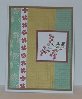
The second card I made for today's challenge and was inspired by my niece and Sugarland; I was going for countrified summer floral.
The third card is a scrap card that I made recently after the Scrap Wrangler video. No, I still have not wrangled any scraps because I have a few other stuff to wrangle first!


The duck and tulip are just darling;) Love your creations.
ReplyDeleteLove your cards Linda, especially the one from your Copic class! Isn't coloring with Copic's so much fun?! I'm surprised and pleased each time I color something.
ReplyDeleteThanks for playing in our Operation Write Home Midweek Throwdown challenge!
Well, Linda, it looks like are picking up good things in your class. Your coloring is great.I love that little chick. The other two cards are lovely as well. Have a great day.
ReplyDeleteThese are all very pretty! Love the duck card!
ReplyDeleteLinda, your cards are wonderful! I love that little chick, and the two floral cards are lovely. Great job on them all!
ReplyDeleteThe coloring on your first card looks great. What surprised me was that you cut the feet off the duck! Haha! Thanks for sharing.
ReplyDeleteGreat cards! I really like that you made an assortment. It is a really great theme!
ReplyDeleteThree nice cards! The duck is so sweet, it guarantees a smile!
ReplyDeleteEach of these cards are so nice and each one is unique. But my fave has to be the chickie with flower! Have fun in your Copics class. I haven't quite made the leap to Copics yet ;)
ReplyDeleteYour cards are all great, but I'm loving that sketch design on the first! Adorable!
ReplyDeleteBoth of these are very nice. I like how you framed the chick image by layers those two corner pieces. That's a greta effect!
ReplyDeleteSuch wonderful cards! I love your clean designs.
ReplyDelete~Cheryl~
**I am having a couple of give-aways on my blog. Feel free to stop by if you are interested.**